As businesses expand, their goals and aims become clearer. When considering a successful rebrand, any design team needs to take three essential questions into account. Firstly, why does the business need to make a change? Secondly, which elements need to remain constant in order to preserve brand equity? And finally, should the change represent an evolution or a revolution for the brand? As the vast majority of branding initiatives involve redesigning and repositioning, we’ve put together several East Anglian examples where well-established businesses have taken the plunge and rebranded and modernised in response to changes in the market.
Bernard Matthews
The well-known turkey farmers commissioned a £3 million rebrand in 2013. This was not the first time that Bernard Matthews changed their image. They also went through a rebrand in 2008 following the negative press around bird flu and Turkey Twizzlers.
The new illustrated logo centres around Great Witchingham Hall, the birthplace of the Bernard Matthews brand in 1950. The simple illustrated style reflects the brand’s rural roots in Norfolk, and the addition of wind turbines signifies their award-winning eco credentials. The aim was to bring to life the brand’s story and to evoke a narrative. The redesign refocuses the company’s identity to celebrate its roots in the East Anglian countryside. This is instead of being associated with a generic association with farming. The style of the illustration conveys a light-hearted charm and quintessential ‘Britishness’ combined with a contemporary, fresh design to appeal to modern families.
University of Suffolk
Formerly the University Campus Suffolk, the University of Suffolk rebranded to better reflect its newly acquired full university status. In 2015, it was granted Taught Degree Awarding Powers and awarded University status. As the only tertiary education institution in Suffolk, it encompasses five sites in the county.
In the words of Only Studio’s Creative Director, the old logo was ‘multi-coloured and youthful’, but its appeal was largely confined to a local market. The new brand aimed to extend that appeal to students from across the globe. The University wanted to reference ‘change’ as a core element and position themselves as a fresh and contemporary university in keeping with the modern world. The yellow angle used throughout the brand collateral references the University being located in the South East of England and provides a clean, sharp contrast to the background. The University’s previous identity was set in the Helvetica typeface while the current one is set in Commercial Types Graphik.
The new logo creates consistency within the brand. The previous iteration had several choices of colour that were chosen by staff – the updated logo has a simple palette of whites, greys and yellows. This resulted in a bold, flexible and thoroughly contemporary successful rebrand that represented the University as a whole.
Greene King
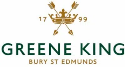
Greene King, established in 1799, is a leading pub retailer and brewer, running over 2,700 pubs, restaurants and hotels from their headquarters in Bury St Edmunds. Their rebrand aimed to differentiate them from other pub brands and better reflect their brand’s personality and authenticity.
The distinctive new logo enables Greene King to stand out from other crown-based brands, complete with a unique typeface and a green, grey and bronze palette that references shades of the rural countryside. The rebrand unites the organisation and reflects the heritage and values of Greene King, with an emphasis on quality.
Surya
Founded in 1998 and based in Harwich, Essex, Surya Foods is one of the largest suppliers of world foods to the UK food sector. Surya’s brand has been modernised to reflect their increased operations and rapid expansion into the food, leisure, and hotel sectors.
The logo incorporates Surya’s traditional blue palette, with the addition of an ‘S’ contained in a circle that represents the international expansion of the business. The new look and feel is streamlined and professional, reflecting the range of subsidiaries in the Surya portfolio and not calling to mind any particular sector. The logo was also designed to make the brand more memorable and create a strong identity.
The successful rebrand was applied across all Surya Foods products internationally with updated packaging and collateral from 2018. This was also applied to Surya Hotels, including properties in Sudbury, Clacton, Colchester and Bury St Edmunds.
Munchy Seeds
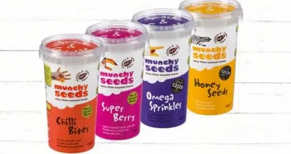
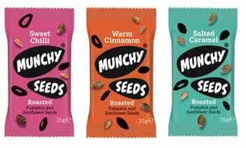
Suffolk-based snack producer Munchy Seeds overhauled its branding and packaging to make it stand out on the shelf and aid the launch of a new range of flavours, moving away from the bright colours and hands painted as animals from the previous brand that appealed more to children. Launched in 1999, Munchy Seeds is the most established seed snack brand in the UK. They sought to reposition their brand with health and flavour conscious consumers who want to enjoy nutritious and delicious snacks as a part of their everyday diet.
The producers of sweet and savoury roasted seeds instead opted for seed-shaped graphics containing the brand name. The health benefits and premium nature of the products were repositioned in favour of a simpler design. The emphasis is now on the hand-roasted, flavourful snacks with the assumption that most consumers are aware of the advantages of seeds as snacks. This has coincided with a packaging overhaul to reduce plastic consumption by 60%.
Ipswich School
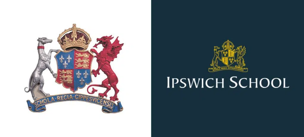
A well-respected education provider from early years through to sixth form, Ipswich School was established in 1399. It boasts a rich heritage with former pupils ranging from historic dukes to artists and scientists. Mackman was commissioned to recruit a higher percentage of prospective pupils to Ipswich School’s open days. As part of this strategy, Ipswich School’s brand was realigned and a solution was created that modernised the design of their visual elements while considering the cohesion of their brand as a whole.
Focus was kept on the pupils at the school with the strapline ‘extraordinary futures’, while the traditional coat of arms was redrawn in a more linear, modern illustrative style to feature on brand collateral in place of the previous photographic style. To reflect Ipswich School’s rich history, a palette of blues, golds and reds was used to create versatile yet unified options. The school needed clear brand guidelines to maintain and manage consistency through their sub and co-brand offerings. This was achieved through practical document templates and tone of voice guidance for printed literature, email, web and social formats. The open days were highly successful and exceeded the targets set for attendance. This positioned Ipswich School as a premium offering in the independent school sector.
How We Can Help With Your Rebrand
At Mackman, we encourage growth by creating brands that are visually distinctive, intelligently positioned and strategically designed to strengthen relationships that your brand has with key audiences.
If you are looking to build a brand or undergo a successful rebrand as part of your growth strategy then Mackman could be the right partner for you. We work with ambitious market leading organisations to develop premium branding and brand development solutions. Our comprehensive brand development services are utilised by organisations of all sizes and across many sectors. Typically they are delivered by blending the skills of our insight, strategy, creative, communications and digital teams.
Brand development is a critical element of your marketing portfolio. It is best delivered by specialists with the experience to deliver the right solution. With comprehensive in-house capabilities our track record speaks for itself; we’ve been trusted to deliver over 450 brands since 2003. We get it right because we know how to avoid common pitfalls; we work collaboratively to evolve engaging brands that resonate with target audiences and their web personas.
Get in contact with us to start your brand development journey and see how we can help your business to grow with a successful rebrand.

