Sector
Academic & Education
Location
Essex
The Thrive Partnership Academy Trust was created with the goal of providing every student with an outstanding education, in an environment where no learner is left behind regardless of their background or ability.
This project incorporated the evolution of a robust, consistent brand identity for an ambitious academy partnership with game-changing goals. We created a brand that upheld the trust’s values and had consistency with the ability to feature in the branding of its partner schools too.
Brand Facts
- Established in September 2016, the Thrive Academy Trust Partnership is currently made up of two schools: Philip Morant School and College, and The Colne Community and School College.
- Their goal is to provide every student with an outstanding education irrespective of their background or ability.
- The Thrive Partnership plans to include primary schools as part of its partnership in the future.
Project Facts
- The Thrive Partnership’s existing branding was overly corporate and disconnected from their ethos of a welcoming and nurturing educational environment.
- They required a modernised identity that not only represents their own identity but could also compliment the identities of their partner schools.


THE CLIENT
Administrating inspirational schools
The Thrive Partnership recognised that their existing branding was overly corporate and disconnected from their ethos. Within the space of a few years, the partnership will expand to include primary school as well as secondary schools and sixth forms. They needed a flexible brand with the ability to grow with them.
Inconsistency undermines the brand identities of numerous schools and Academy Trusts, so creating a brand identity that fits seamlessly with the identities of their partner schools was a priority. The new branding needed the dynamism to coexist alongside the identities of their current partner schools whilst simultaneously promoting the partnership to potential partner schools too.
The Challenge
As an ambitious partnership, Thrive required a modernised identity that not only represents their own identity but could also compliment the identities of their partner schools too. The new brand identity had to have the robustness to change any negative perceptions regarding Academy Trusts held by parents, students or members of the public.
OUR PROCESS
Creating a brand for the future
For an umbrella organisation like The Thrive Academy Partnership, consistency is vital but challenging to preserve. We created a practical brand identity toolkit for them that consisted of logos, typefaces/fonts and straplines, a distinct image style and photography, and primary and secondary colour palettes.
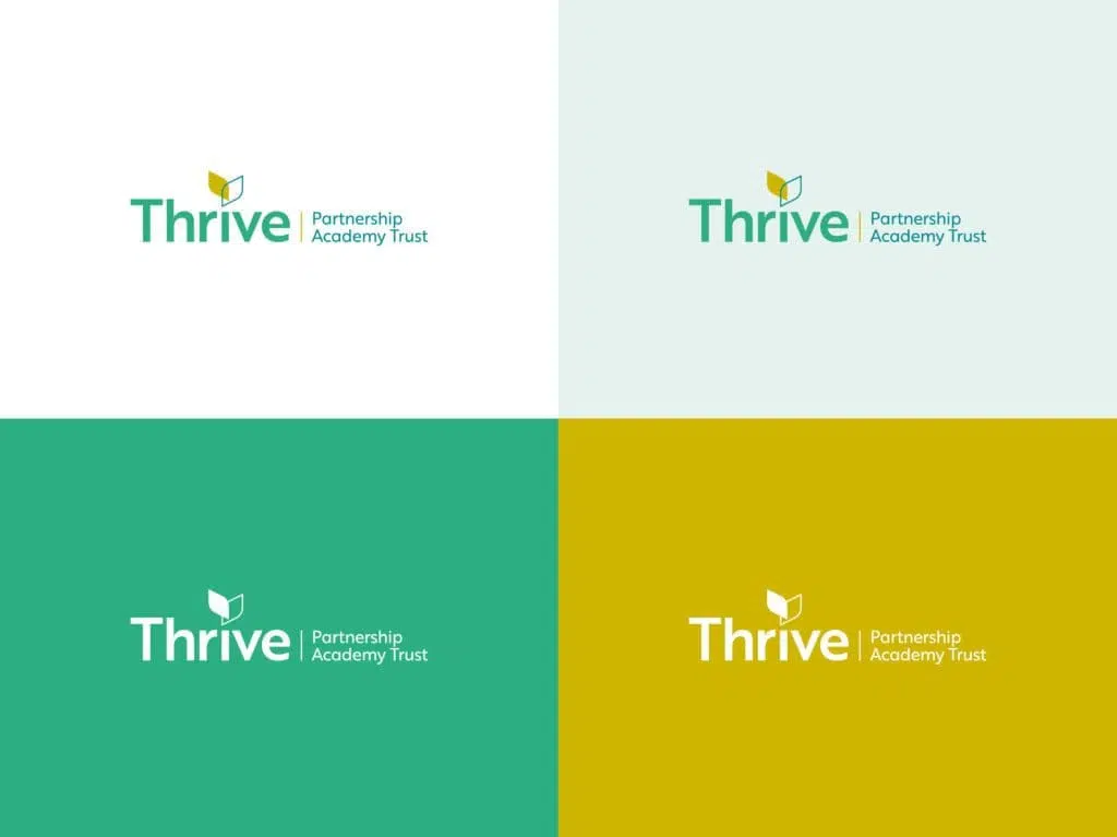
To emphasise The Thrive Partnership’s nurturing values and to eliminate any corporate feel, we populated their primary colour palette with vibrant, youthful shades of green, blue and yellow. We chose yellow, a colour that represents energy, enthusiasm and intellect, to feature in the primary colour palette of both the Thrive Partnership and their partner schools.
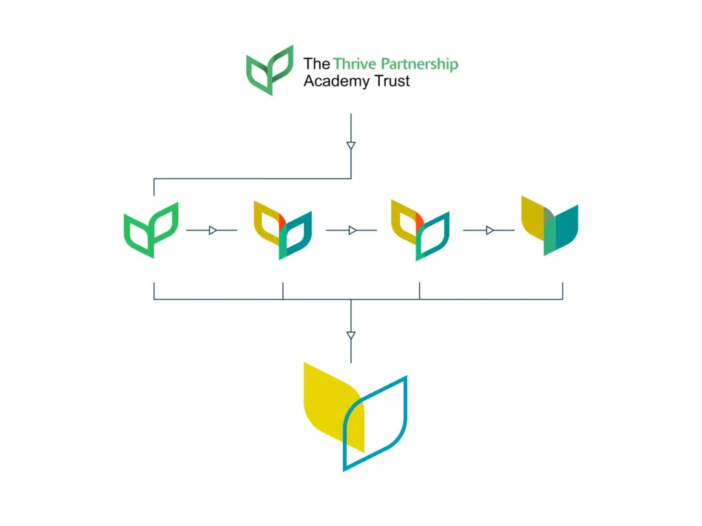
Rebranding an organisation: Refining the logo
When evolving the Thrive Partnership’s logo, our design experts retained the leaf emblem to maintain familiarity, but also because the leaves embody Thrive’s strapline, “Working together to succeed”.
We adjusted and repositioned the leaves to point in different directions, one to the East and the other to the West to demonstrate that regardless of the path a student may wish to follow, the Thrive Partnership will support them.
Defining a palette: creating consistency
To promote the Thrive Partnership as a modern and forward-facing brand, we used gradients across their marketing collateral as well as their partner school’s collateral.
This is a vital attribute to any school’s brand identity, but especially across the Thrive’s partner schools, The Philip Morant School and College and The Colne Community School and College, who pride themselves on being innovative, dynamic and lively.
The Results
By softening their existing brand’s logo, we were able to emphasise their values and nurturing nature, stepping away from their original corporate image. With the knowledge that the partnership plans to expand to include not only secondary but also primary schools, the softened logo also creates a welcoming, friendly and approachable feel. The Thrive Partnership now also have a fully primed brand identity toolkit to ensure that consistency is maintained.
In addition to retaining the colour yellow throughout the Thrive Partnership’s schools, they also share a secondary colour palette too. Connecting the schools in this way helped to create a consistent, unified feel amongst the partnership. Through the use of a forward-thinking and dynamic brand, we were able to align The Thrive Academy Partnership Trust’s branding with the innovative disposition of its existing schools.

Thrive approached Mackman with the task of creating a robust identity scheme for their trust and the schools within it. Our challenge was developing an aesthetic that was clean and confident yet also nurturing and supportive of its schools. The identity needed to filter sympathetically down to school-level without dominating and overpowering the school’s own image.
Bruce Burgoyne, Creative Director – Mackman
