The logo is a crucial element in your overall brand image and identity. In the world we live in today, a logo can serve many different purposes, both printed and on screen. A professionally designed logo has the ability to serve its business for years to come, turning prospective customers into long-standing clients.
An expert logo has the power to define a brand, having a major impact on how current and future customers perceive your company. With this in mind, a logo needs to be eye-catching, memorable, and able to embody your brand’s identity.
Capturing the essence of your brand and business in one iconic design
A Long Term Design
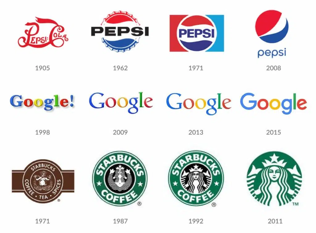
There are very few, if any, logos that are truly timeless. Even some of the most recognisable logos in the world have adapted over time to remain current. Although it is inevitable that your logo will adapt and evolve over time, there are some ways you can ensure that the initial design will last as long as possible.
Avoiding current trends is advisable when developing a brand logo. Trends come and go, leaving you with a design that could be irrelevant or outdated within a year. Therefore, when it comes to initial research into your logo design, stay away from what is popular right now, and instead focus on your brand identity, and what you want your logo to say about your brand. The colour, font choice, message and illustration of your logo can all contribute to the brand image you want to convey to your customers.
Over years to come, your company will change and evolve to meet the ever-changing world, and so will your logo. However, looking closely at the logo evolution of some of the most recognisable brands, it is plain to see that these logos are becoming simpler and more easily recognisable.
As designers, we know that the most powerful and effective logo designs, are artfully simple. However, it’s not a case of whipping up a quick design, the craft is about conveying a brand’s identity in the most efficient way possible.

Colour Palette
A harmonic colour palette is an important asset to any brand identity, which can sometimes be as recognisable as a logo itself, I’m sure we can all recognise the iconic purple wrapped chocolate bar without any words appearing on the packaging.
However, when it comes to incorporating your brand colours into the logo design, try to limit the number of colours within the design. A brand may have an extensive colour palette to dip into, but these don’t all need to be present in the logo, in fact the best logos will even stand out when in black and white.
Having too many colours will result in a busy logo that is difficult for customers to remember and challenging for a brand to adapt to. Try sticking to a maximum of 3 colours in your logo that complement each other and form an easy to read and memorable design.
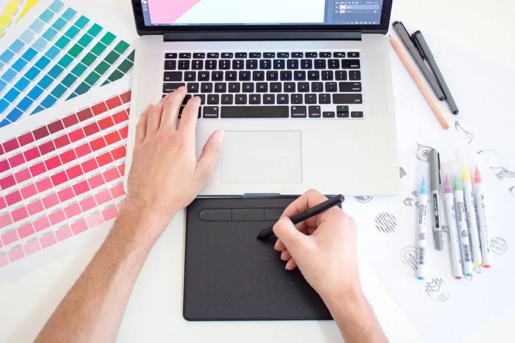
Tip: In most cases, the colour of a logo should come after the design itself, so try to find one initial colour that works with the design. Once you have established a primary colour for the logo, you can add any additional colours if it improves the design.

Font Choice
Just like using colours within your logo design, a restrictive but well thought out font choice is crucial in the success of a branded logo. Too many fonts will become confusing and will result in an unclear brand identity, so once again, sticking to one or two font choices within the logo will build a memorable but cohesive design.
It is also important to source a unique font that sets you apart from your competitors. Yes, there are an overwhelming amount of font choices out there, whether they be free or otherwise, but taking the time to find the right font for your brand will pay off.
Common or trending fonts can quickly become outdated, meanwhile, some more classic fonts have perceived connotations with existing big-name brands, so sourcing a unique and clean font will help to develop a logo that will last.
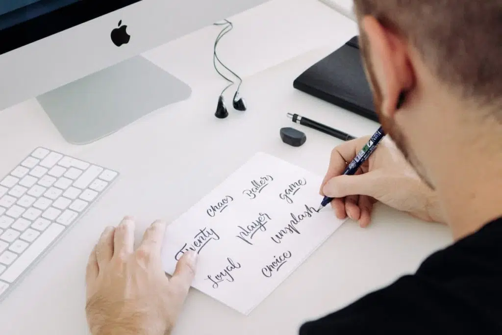
When selecting a font to work within your logo, legibility should be seriously considered before making a final decision. Script fonts can suit some brands perfectly as they offer an elegant, organic nature to a design. Similarly, display and decorative fonts can portray a whimsical quality to a logo. However, the question still needs to be posed, ‘can the customer read the name of my brand?’ If the answer is no, the search must continue.
Tip: Pinterest can be a great starting point for researching font options for your logo, as well as Typewolf and Typespiration for specific font pairings. If you’re looking for further help with choosing your font, check out our article on Selecting A Font For Your Brand.

Less is More
Maintaining a minimal but cohesive logo design will help make your brand memorable and flexible. An extensive mix of type, colours, shapes, icons, layout options and illustration will result in a complicated and rigid logo design that is difficult for a brand to apply to different platforms. Keeping the number of elements that make up your logo to a minimum will create a simple design that will continue to benefit your brand for years to come.
Tip: Remember the words of Coco Chanel, “Before you leave the house, look in the mirror and take one thing off ”, which can certainly be applied to the world of graphic design. Once you have developed your logo design, try taking an element away from the overall concept, it just might improve it.
A Brand isn’t Just a Logo
There is so much more to a branding project than just a logo, it’s an extensive and complicated process which can sometimes take the best part of a year to perfect. You could also say a brand isn’t just one logo. A single brand will make use of multiple logos, depending on what they need the logo for.
For example, a logo may work perfectly as the header of a company website, but then when you try to bring it into Instagram as a profile picture, you may find it doesn’t fit. Logo variations are essential when developing a brand toolkit, so when beginning your logo design journey, it should be considered that this logo style must also be applicable as a banner design, roundel, emblem or stack. Having logo flexibility means your brand has the power to stretch further and therefore be more visible.
Less is certainly more when it comes to an effective yet flexible logo design that can be used into the future. Taking a minimal approach mixed with a careful selection of logo elements can help define and build your brand. On the other hand, an overcomplicated design that has not been created with your brand’s identity in mind, can result in the wrong brand image or message being delivered to customers.
summary
Our portfolio of branding projects demonstrates our expertise on the subject and showcases the power of a simple but effective logo design. At Mackman, we offer comprehensive brand development services that help leading brands stand out in a crowded marketplace.
If you want to find out more about our creative process and determine if we would make a good fit, then please head over to the Contact Us page. Alternatively, you can leave an email with customerservice@mackmangroup.co.uk or even a call on 01787 388038.
